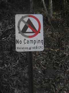
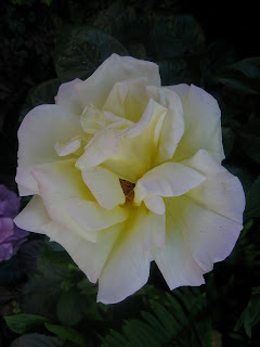
Continued, having the focus of an image being in the last third of a photo either on the left or right. Included in this shoot are another lantern and a window.
Thursday, September 26, 2013
Wednesday, September 25, 2013
Rule of Thirds 1
For the "Rule of Thirds" photoset, we are encouraged to break out of the typical pictures with a point of focus in the center. The goal here is to have the focal point of the picture taking up about 1/3rd of the image on the left or right side.
Friday, September 20, 2013
Depth staging 2
Another set of 3 photos as part of the depth staging assignment, having the camera focus on an object in the foreground set against a larger background to create a sense of depth. Images partially saturated via photoshop.
Thursday, September 19, 2013
Depth staging 1
Here is a series of 3 shots demonstrating "depth staging", or having objects in the foreground and background to specifically get a sense of depth and distance in a shot.
Wednesday, September 18, 2013
Telephone pole
A single shot of a line of telephone poles showing repetition into the background. Taken in black and white.
Monday, September 16, 2013
Up and down the stairs
For this photo series, I photographed stairs in an effort to produce depth through a repetitive shape (in this case, stairs). Selective saturation done via photoshop.
Wednesday, September 11, 2013
Nooks and crannies
I used the presence of leading lines on both sides of the photograph to shoot into "closed space" areas, such as between library shelves, into an alleyway, or a railing heading down the stairs. Selective saturation done via photoshop.
Up and down the street
In an effort to create depth in an image using "leading lines", I found that looking up or down a sidewalk while including a wall or side of a building creates leading lines towards the end of the street. Selective saturation used in Photoshop to emphasize leading lines.
Monday, September 9, 2013
Friday, September 6, 2013
Contrasted flower
In these 3 shots, I photographed a flower right outside of the school. I turned the exposure value down on the camera and adjusted the contrast in order to make the single flower stand out against the leaves in the background and give the pictures depth. I took the photos from 2 varying distances and 2 different angles.
Red, white and black
In this 3 photo series, I experimented with a mix of a desaturated image with color on one particular object in order to put emphasis on certain aspects of the photo. I took photos from varying distances and angles to get different backdrops for the flag.
Subscribe to:
Comments (Atom)


